Design Better Add-Ons for Adobe Express with Our UX Guidelines | by Joel Ebner | Mar, 2024


This is going to be helpful for two reasons: First, you’ll gain a nuanced understanding of the components we often employ for add-ons, each of which has specific use cases. Second, you’ll start to see how components are used — both as standalone components and in relation to one another. Again, this is a bit like referencing a recipe for a meal: Understanding your separate ingredients while also getting a good idea of how they fit together will help you see how the principled use of component-level designs can translate into meaningful results for your add-on.
Using add-ons that are already publicly available will reinforce some of the notions outlined in our first recommendation: You’ll gain an even better understanding of what components we use and how they fit together to generate meaningful feature additions for Adobe Express. Since many of the current add-ons are built on the principles we’ve outlined, they’ll help you visualize what the end result might look like when you align your add-on’s design with our recommendations.
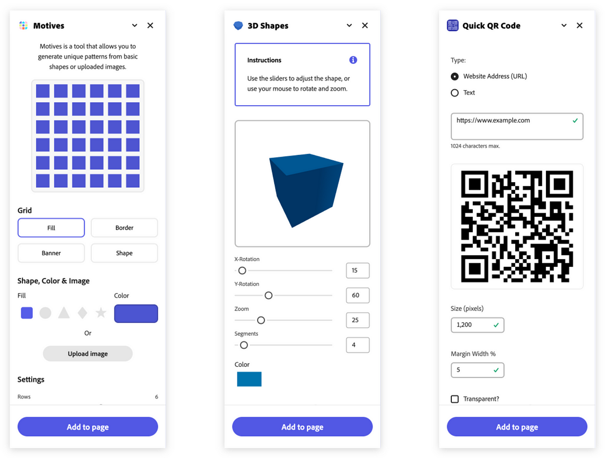
Three specific add-ons which nicely manifest these principles are:
When looking at these three add-ons, pay attention to these details referenced in our guidelines:
You might be noticing a recurring theme across our recommendations — proper use of Spectrum can significantly enhance the quality of your add-on.
Design systems are great resources for a couple of reasons. First, they reduce the guesswork that often goes into making functional and visual decisions. When starting a design project, it’s natural to have questions like “how should buttons be styled?”, or “what font sizes should I use for my H1, H2, and H3?”. Leaning on a consistent framework for answering those questions, then, makes it easier for us as designers to focus on solving core user problems, rather than getting hyper-focused on component-level details.
End users also benefit significantly from design systems. If you’ve ever opened up an application and felt like every panel, text field, and interaction was designed by a different team, then you may understand why — inconsistency can be jarring. So when designers use systems to frame out their projects, end users reap the benefits by way of having a unified, cohesive experience to explore.
None of this is to say that design systems alone can answer questions regarding visual hierarchy, style, and UX patterns — that, in part, is why the Extensibility team decided to create guidelines specifically for add-ons! But if you use Spectrum while also cross-referencing the documentation for Adobe Express add-ons, then you should be able to generate an add-on that will be intuitive, familiar, and delightful for users.
For more tips on how to use Spectrum to build better Adobe Express add-ons, watch this 10-minute workshop hosted by our designer Stephanie Corrales and check out her slides for reference:
Constraints are a natural part of creating any user experience; while not always ideal, the limitations we face as designers not only shape the things we make, they can also clarify our objectives.
The add-on panels — which are a structural extension of the editor panels in Adobe Express — have some clear limitations with regard to width and height. That’s intentional: Since we want to make as much room as possible for users to focus on the content they are designing — i.e., the pages central to each project — we want our side panels to be narrow enough to not get in the way.
The main container for add-ons maintains a consistent 320px width, while the height remains dependent on the browser. Those dimensions — which typically render as a tall rectangle — require you as a designer to think specifically about how to organize your add-on so that the experience for users is intuitive.
Here are some things to keep in mind:
